# library(cardea)
# Load the tidyverse
library(tidyverse)
#> ── Attaching packages ─────────────────────────────────────── tidyverse 1.3.2 ──
#> ✔ ggplot2 3.4.0      ✔ purrr   1.0.1
#> ✔ tibble  3.1.8      ✔ dplyr   1.0.10
#> ✔ tidyr   1.2.1      ✔ stringr 1.5.0
#> ✔ readr   2.1.2      ✔ forcats 0.5.2
#> ── Conflicts ────────────────────────────────────────── tidyverse_conflicts() ──
#> ✖ dplyr::filter() masks stats::filter()
#> ✖ dplyr::lag()    masks stats::lag()
library(scales)
#>
#> Attaching package: 'scales'
#>
#> The following object is masked from 'package:purrr':
#>
#>     discard
#>
#> The following object is masked from 'package:readr':
#>
#>     col_factor
library(patchwork)
This vignette shows how to make various charts in ggplot.
Pie Charts
https://show.rfor.us/r9TtRL01 (Best Starts page 17)
# Set the size of the hole in the center of the chart
hole <- 0.9

# Create the data frame for the chart
pie_df <- tibble(
  group = c("Communuty Informed", "Public Health"),
  number = c(362, 374)
) %>%
  mutate(fill_txt = glue::glue("{group} ({number})"))

# Create the chart using the pie_df data frame
ggplot(data = pie_df, mapping = aes(x = hole, y = -number, fill = fill_txt)) +
  # Add bar chart geom to the plot
  geom_col(width = 0.50) +
  # Add text geom to the center of the plot
  geom_text(
    aes(x = 0, y = 0, label = sum(number)),
    size = 15,
    fontface = "bold"
  ) +
  # Set the chart to a polar coordinate system
  coord_polar(theta = "y") +
  # Set the x axis limit
  scale_x_continuous(limits = c(0, hole + 0.25)) +
  # Set the fill colors manually
  scale_fill_manual(values = c("#EA793C", "#FADEC6")) +
  # Remove the labels and titles for x and y axis and legend
  labs(title = NULL, x = NULL, y = NULL, fill = NULL) +
  # Set the chart theme to classic
  theme_void() +
  # Customize the legend
  theme(
    # Put the legend on the bottom
    legend.position = "bottom",
    # Set the legend direction to horizontal
    legend.direction = "horizontal",
  )
Total number of care providers who completed intake
Bar Charts
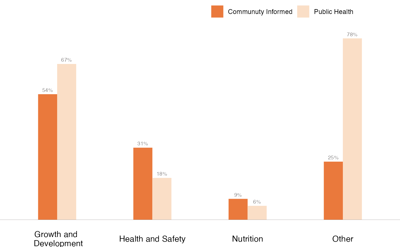
Dodged Bar Charts
https://show.rfor.us/lTxc9SZ6 (Best Starts page 23)
# Creating a data frame from the data for dodged Bar Charts
df_dodgedBar <- tibble(
  # Create columns with respective values
  group = c("Growth and \n Development", "Health and Safety", "Nutrition", "Other"),
  "Communuty Informed" = c(0.54, 0.31, 0.09, 0.25),
  "Public Health" = c(0.67, 0.18, 0.06, 0.78)
) %>%
  # Reshaping the data frame
  pivot_longer(
    cols = -group,
    names_to = "type",
    values_to = "pct"
  ) %>%
  # Create a column with formatted percents
  mutate(pct_formatted = percent(pct))


# Creating a dodged bar plot using the ggplot library
ggplot(df_dodgedBar, aes(x = group, y = pct, fill = type)) +
  # Adding a bar plot
  geom_col(position = "dodge", width = .4) +
  # Adding a horizontal line at y = 0
  geom_hline(
    aes(yintercept = 0),
    color = "#797676",
    linewidth = 0.1,
    show.legend = FALSE
  ) +
  # Setting the fill color for the bars
  scale_fill_manual(values = c("#EA793C", "#FADEC6")) +
  # Set the y axis limits
  scale_y_continuous(limits = c(0, 0.9)) +
  # Adding labels to the bars
  geom_text(
    aes(label = pct_formatted),
    vjust = -0.6,
    size = 2.5,
    colour = "#797676",
    position = position_dodge(.4)
  ) +
  # Remove the labels and titles for x and y axis and legend
  labs(title = NULL, x = NULL, y = NULL, fill = NULL) +
  # Using theme_void to start
  theme_void() +
  # Customizing the plot's appearance
  theme(
    # Setting the legend position
    legend.position = c(0.7, 0.95),
    # Setting the legend direction to horizontal
    legend.direction = "horizontal",
    # Add back the x axis text after theme_void() removed it
    axis.text.x = element_text()
  )
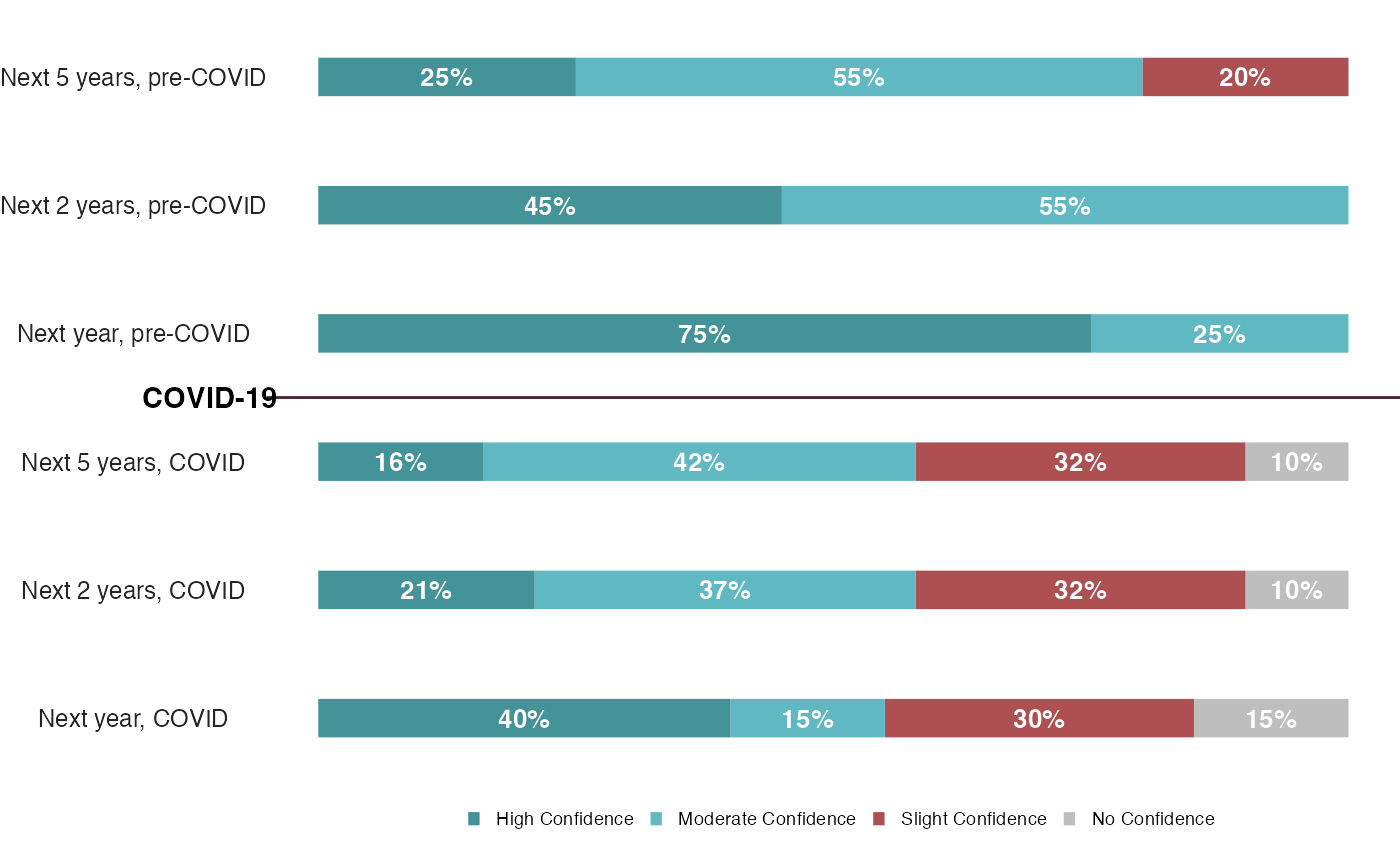
100% Stacked Bar Charts
https://show.rfor.us/Mpj3NRmH (King County page 26)
# Create first dataframe "df_PreCovid"
df_PreCovid <- tibble(
  Period = c("Next year", "Next 2 years", "Next 5 years"),
  "No Confidence" = 0,
  "Slight Confidence" = c(0, 0, 0.20),
  "Moderate Confidence" = c(0.25, 0.55, 0.55),
  "High Confidence" = c(0.75, 0.45, 0.25)
) %>%
  # Add ", pre-Covid" after each periods and convert it to factor
  mutate(
    Period = paste0(Period, ", pre-COVID"),
    Period = factor(Period, Period)
  ) %>%
  #' It pivots the columns with names "No Confidence", "Slight Confidence", "Moderate Confidence", and "High Confidence" to
  #' a new variable "Confidence" and the values to "pct"
  pivot_longer(
    cols = -Period, # exclude "Period" column from pivoting
    names_to = "Confidence", # new column name for pivot columns
    values_to = "pct" # new column name for pivot values
  )

#' Second data frame (df_COVID) is created  using a similar
#' process as the first (df_PreCovid)
df_COVID <- tibble(
  Period = c("Next year", "Next 2 years", "Next 5 years"),
  "No Confidence" = c(0.15, 0.1, 0.1),
  "Slight Confidence" = c(0.30, 0.32, 0.32),
  "Moderate Confidence" = c(0.15, 0.37, 0.42),
  "High Confidence" = c(0.4, 0.21, 0.16)
) %>%
  mutate(
    Period = paste0(Period, ", COVID"),
    Period = factor(Period, Period)
  ) %>%
  pivot_longer(
    cols = -Period,
    names_to = "Confidence",
    values_to = "pct"
  )

#' Creating a tibble named df_stBar_1 by combining
#' the df_COVID and df_PreCovid tibbles using the bind_rows function
df_stBar_1 <- df_COVID %>%
  bind_rows(df_PreCovid) %>%
  mutate(Confidence = factor(Confidence, unique(Confidence)))

# Plot the new data frame with ggplot
ggplot(
  df_stBar_1,
  aes(x = Period, y = pct, fill = Confidence)
) +
  # Add a bar chart with width 0.3
  geom_bar(stat = "identity", width = .3) +
  # Add a text label for each bar with pct, color white, and size 3.5
  geom_text(
    aes(label = ifelse(pct == 0, "", percent(pct)), fontface = "bold"),
    color = "white",
    size = 3.5,
    position = position_stack(vjust = .5)
  ) +
  # Add horizontal line
  geom_vline(xintercept = 3.5,
             color = "#4C2432") +
  # Add label to horizontal line
  annotate(geom = "text",
           x = 3.5,
           y = 0,
           hjust = 1.3,
           fontface = "bold",
           label = "COVID-19") +
  # Manually set the fill colors for the bars
  scale_fill_manual(
    values = c("#BEBEBE", "#AE5052", "#60B8C3", "#439398"),
    guide = guide_legend(reverse = TRUE) # Reverse the legent text order
  ) +
  # The plot is flipped horizontaly
  # clip = "off" makes sure the COVID-19 text doesn't get cut off
  coord_flip(clip = "off") +
  # Remove the background and axis labels of the plot
  theme_void() +
  theme(
    # Set the legend position to bottom, remove the legend title
    legend.position = "bottom",
    # set the legend margin and key size, set the legend text to bold and size 7
    legend.title = element_blank(),
    # Add y axis text
    axis.text.y = element_text(color = "#242424", size = 9),
    # Set legend text size to 7
    legend.text = element_text(size = 7),
    # Set legend key size
    legend.key.size = unit(0.2, "cm"),
    # Add pace to the bottom of the legend box
    legend.margin = margin(b = .5, unit = "cm")
  )
Stacked Bar Charts
https://show.rfor.us/tpYx4VpM (STI Express page 32)
# Create a data frame with columns group, Express, Non-express
df_stBar_2 <- tibble(
  group = c(
    "New York City",
    "Nashville",
    "Monroe Country",
    "Orange Country",
    "Seattle",
    "Denver",
    "Haward Brown"
  ),
  Express = c(141, 95, 103, 122, 56, 53, 43),
  "Non-express" = c(259, 146, 112, 79, 104, 89, 0)
) %>%
  # Wrap the long text
  mutate(group = str_wrap(group, 10)) %>%
  # Add a new column "Total" which is the sum of "Express" and "Non-express" columns
  mutate(Total = Express + `Non-express`) %>%
  # Order the data frame based on the Total column in descending order
  arrange(desc(Total)) %>%
  # Recode the group variable as a factor
  mutate(group = factor(group, group)) %>%
  # Reshape the data frame so that it can be used with ggplot
  pivot_longer(
    cols = -c(group, Total),
    names_to = "type",
    values_to = "pct"
  ) %>%
  # Create a new column "label"
  mutate(label = ifelse(type == "Non-express", Total, ""))


# Plot the new data frame with ggplot
ggplot(df_stBar_2, aes(x = group, y = pct, fill = type)) +
  # Add a bar chart with width 0.45
  geom_bar(stat = "identity", width = .45) +
  # Add a text label for each bar with pct, color white, and size 3
  geom_text(
    aes(label = ifelse(pct == 0, "", pct)),
    color = "white",
    size = 3,
    position = position_stack(vjust = .85)
  ) +
  # Add a text label for each group of bars with Total+15, color black, and size 3
  geom_text(
    aes(x = group, y = Total + 15, label = label, fontface = "bold"),
    color = "black",
    position = position_identity(),
    size = 3
  ) +
  # Add a horizontal line at y = 0
  geom_hline(
    aes(yintercept = 0),
    color = "#797676",
    size = 0.1,
    show.legend = FALSE
  ) +
  # Manually set the fill colors for the bars
  scale_fill_manual(values = c("#408E9B", "#522762")) +
  # Remove the background and axis labels of the plot
  theme_void() +
  theme(
    # Set the legend position to bottom, remove the legend title
    legend.position = "bottom",
    # set the legend margin and key size, set the legend text to bold and size 7
    legend.title = element_blank(),
    legend.margin = margin(0.5, 0.5, 0.5, 0.5, "cm"),
    # set the axis text to bold and size 8, and set the plot margin
    axis.text.x = element_text(face = "bold", size = 8)
  )
#> Warning: Using `size` aesthetic for lines was deprecated in ggplot2 3.4.0.
#> ℹ Please use `linewidth` instead.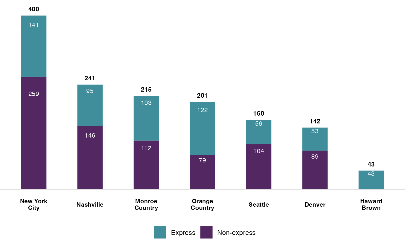
Diverging Bar Charts
https://show.rfor.us/FdD5rYYR (Best Starts page 43)
#' This code creates a bar plot visualizing two sets of data, "Public Health" and
#' "Community-Informed", using the `patchwork` library.

# The data is first stored in a tibble (df_divBar) with columns: responses, Community-Informed, and Public Health.
df_divBar <- tibble(
  responses = c(
    "I have increased use of strategies to encourage positive behavior",
    "I will talk to parents about child concerns",
    "I improved my abilty to plan developmentally appropriate activities",
    "I know how to better support nutrition",
    "I know more ways to make the care space safer"
  ),
  "Community-Informed" = c(0.76, 1, 0.71, 1, 1),
  "Public Health" = c(0.41, 0.93, 0.32, 1, 1),
) %>%
  mutate(responses = str_wrap(responses, 25)) %>%
  # The responses column is converted to a factor with the order of the responses.
  mutate(responses = factor(responses, responses))

# First plot (p1) is created for "Public Health" using ggplot.
p1 <- ggplot(
  df_divBar,
  aes(x = responses, y = `Public Health`, fill = "Public Health")
) +
  # geom_col is used to create a column chart, with the width set to .3.
  geom_col(width = .3) +
  # The color fill is set to a specific hex value "#FADEC6" using scale_fill_manual.
  scale_fill_manual(values = "#FADEC6") +
  # The text labels are added to the bars displaying the percentage of the "Public Health".
  geom_text(
    aes(label = percent(`Public Health`), fontface = "bold"),
    size = 2.5,
    hjust = 1.3,
    colour = "black",
    position = position_dodge(.4)
  ) +
  # coord_flip is used to flip the plot so that it is horizontal.
  coord_flip() +
  # theme_void and theme functions are used to customize the look and style of the plot.
  theme_void() +
  theme(
    axis.text.y = element_text(size = 9),
    legend.position = "bottom",
    legend.title = element_blank()
  )

#' Second plot (p2) is created for "Community-Informed" using a similar
#' process as the first plot.
#' The only difference is the mapping of the y axis
#' to -`Community-Informed` instead of `Public Health`,

p2 <- ggplot(
  df_divBar,
  aes(x = responses, y = -`Community-Informed`, fill = "Community-Informed")
) +
  geom_col(width = .3) +
  scale_fill_manual(values = "#EA793C") +
  geom_text(
    aes(
      label = percent(`Community-Informed`),
      fontface = "bold"
    ),
    size = 2.5,
    hjust = -0.3,
    colour = "black",
    position = position_dodge(.4)
  ) +
  coord_flip() +
  theme_void() +
  theme(
    legend.position = "bottom",
    legend.title = element_blank()
  )

# Finally, the two plots (p1 and p2) are combined into one using the pipe operator (|).
p2 | p1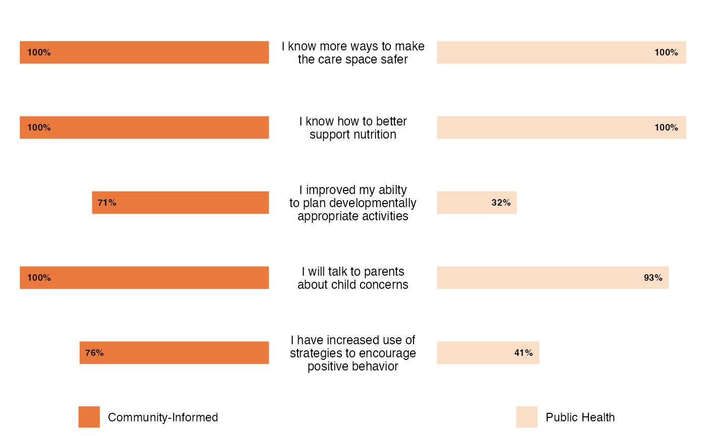
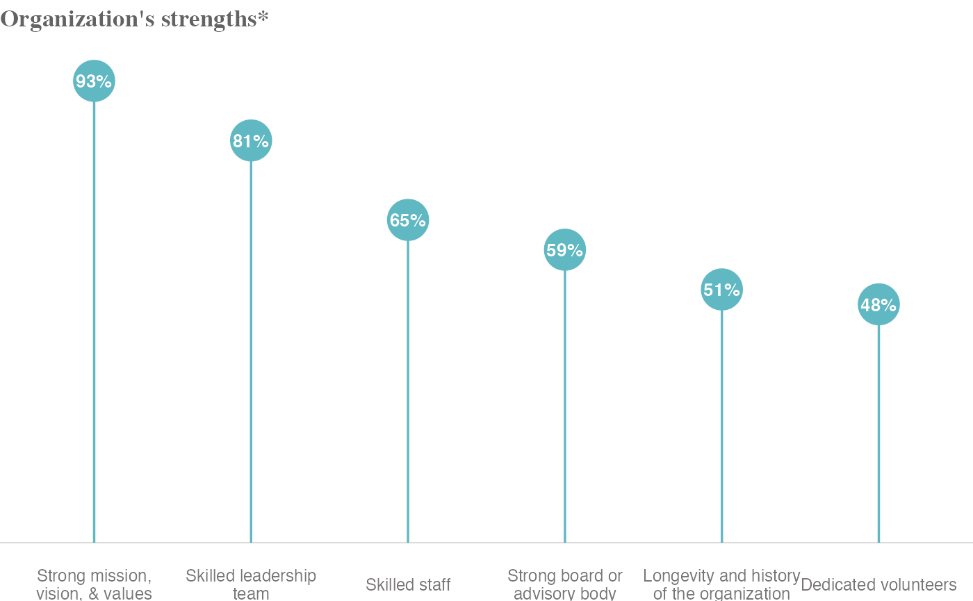
Lollipop Charts
https://show.rfor.us/48qwCsjv (King County page 16)
# Create a tibble data frame
df_lollipop <- tibble(
  organization = c(
    "Strong mission, vision, & values",
    "Skilled leadership team",
    "Skilled staff",
    "Strong board or advisory body",
    "Longevity and history of the organization",
    "Dedicated volunteers"
  ),
  value = c(0.93, 0.81, 0.65, 0.59, 0.51, 0.48)
) %>%
  # sort the data in descending order of the 'value' column
  arrange(desc(value)) %>%
  # wrap the text in 'organization' column to max length of 22
  # and convert the 'organization' column to a factor
  mutate(
    organization = str_wrap(organization, 22),
    organization = factor(organization, organization)
  )

# Create chart with ggplot
ggplot(
  df_lollipop,
  # set the x axis to the 'organization' column and y axis to the 'value' column
  aes(x = organization, y = value)
) +
  # Add a title to the chart
  labs(title = "Organization's strengths*") +
  # Add segment lines between x axis and y axis
  geom_segment(
    aes(
      x = organization, y = 0,
      xend = organization, yend = value
    ),
    color = "#60B8C3",
    size = .6
  ) +
  # Add points for each data point
  geom_point(size = 10, color = "#60B8C3") +
  # Set the limit of y axis to maximum value in the 'value' column + 0.05
  scale_y_continuous(limits = c(0, max(df_lollipop$value) + 0.05)) +
  # Add text labels for each data point
  geom_text(
    aes(y = value, label = percent(value), fontface = "bold"),
    size = 3.5,
    colour = "white"
  ) +
  # Add a horizontal line at y = 0
  geom_hline(
    aes(yintercept = 0),
    color = "#797676",
    size = 0.1,
    show.legend = FALSE
  ) +
  # Apply theme_void theme to the chart
  theme_void() +
  # Customize chart elements
  theme(
    # Set font family, face, and color for the chart title
    title = element_text(family = "Times", face = "bold", color = "#636363"),
    # Set size and color for the x axis labels
    axis.text.x = element_text(size = 9, colour = "#797676")
  )
Dot Plots
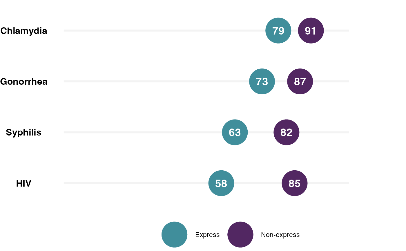
https://show.rfor.us/LdScJtzk (STI Express page 25)
# df_DotPlot is a tibble created with 4 location names and their respective Express and Non-express values
df_DotPlot <- tibble(
  location = c("HIV", "Syphilis", "Gonorrhea", "Chlamydia"),
  Express = c(58, 63, 73, 79),
  "Non-express" = c(85, 82, 87, 91)
) %>%
  # location values are converted to a factor
  mutate(location = factor(location, location))

# ggplot function starts here with df_DotPlot as its data source
ggplot(
  df_DotPlot,
  # x-axis is mapped to location
  aes(x = location)
) +
  # A segment is added to the plot with y-range 0 to 105, color #F3F3F3 and size 1.2
  geom_segment(
    aes(
      x = location, y = 0,
      xend = location, yend = 105
    ),
    color = "#F3F3F3",
    size = 1.2
  ) +
  # y-axis limits are set to 0 to 114
  scale_y_continuous(limits = c(0, 120)) +
  # A point is added to the plot with y value as Non-express + 10, color "#522762" and size 15
  geom_point(
    aes(y = `Non-express`, color = "Non-express"),
    size = 15
  ) +
  # A point is added to the plot with y value as Express, color "#408E9B" and size 15
  geom_point(
    aes(y = Express, color = "Express"),
    size = 15
  ) +
  # Color manual is set for the plot with Non-express color "#522762" and Express color "#408E9B"
  scale_color_manual(values = c("#408E9B", "#522762")) +
  # Text is added to the plot with y value as Express, font face as bold, size 5 and color white
  geom_text(
    aes(
      y = Express,
      label = Express,
      fontface = "bold"
    ),
    size = 5,
    colour = "white"
  ) +
  # Text is added to the plot with y value as Non-express + 10, font face as bold, size 5 and color white
  geom_text(
    aes(
      y = `Non-express`,
      label = `Non-express`,
      fontface = "bold"
    ),
    size = 5,
    colour = "white"
  ) +
  # The plot is flipped vertically
  coord_flip() +
  # Theme void is applied to the plot
  theme_void() +
  # Customizing plot's text size, legend position and hiding the legend title
  theme(
    axis.text.y = element_text(face = "bold", size = 12),
    legend.position = "bottom",
    legend.title = element_blank()
  )