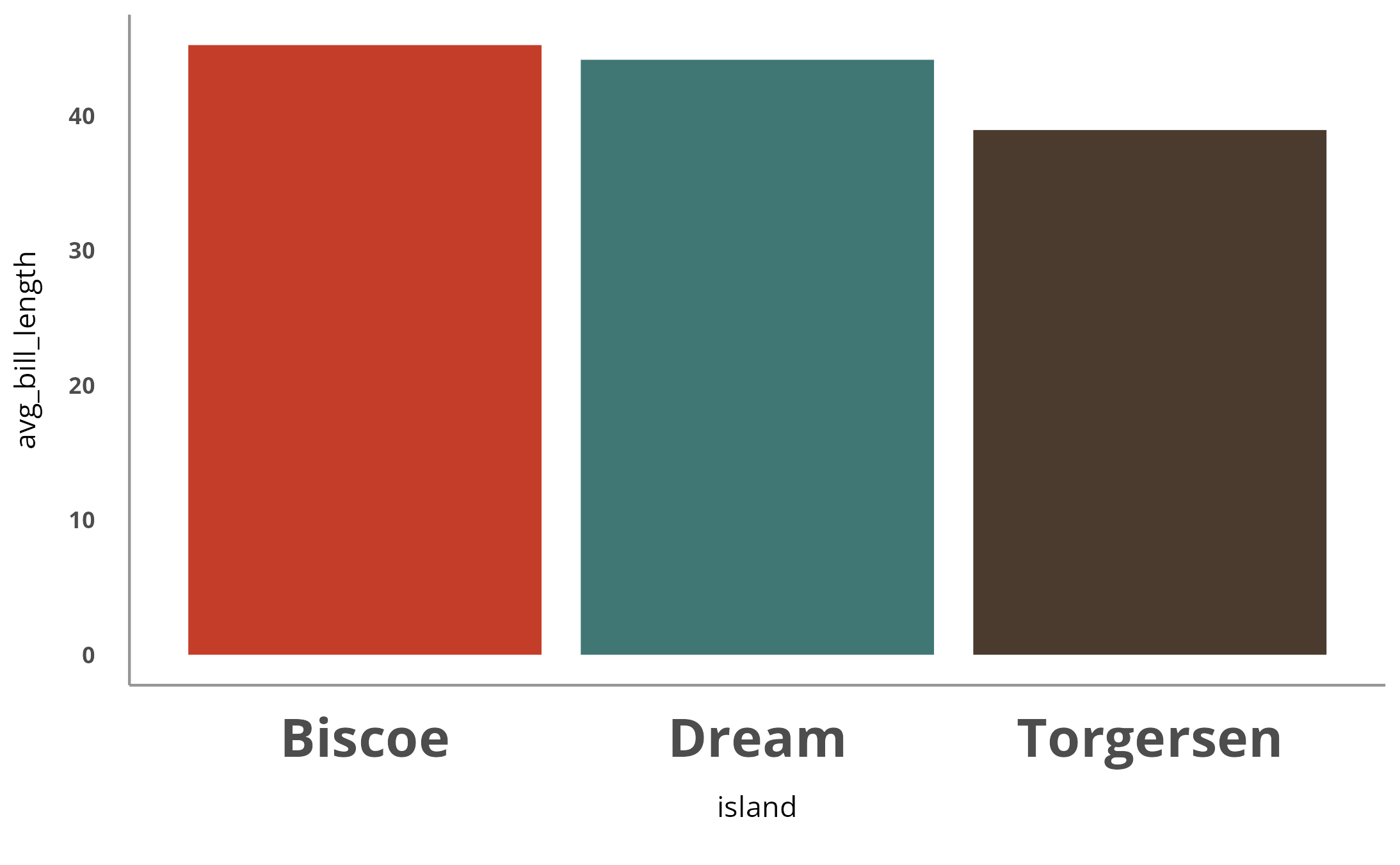
You can add the function theme_cardea() to the end of
any ggplot2 pipeline and it will generate plots that follow Cardea
guidelines.
penguins %>%
  group_by(island) %>%
  summarize(avg_bill_length = mean(bill_length_mm, na.rm = TRUE)) %>%
  ggplot(aes(x = island, y = avg_bill_length,
             fill = island)) +
  geom_col() +
  scale_fill_cardea_discrete() +
  theme_cardea()
By default, there are x and y axis lines. You can remove them using
the show_axis_lines argument.
penguins %>%
  group_by(island) %>%
  summarize(avg_bill_length = mean(bill_length_mm, na.rm = TRUE)) %>%
  ggplot(aes(x = island, y = avg_bill_length,
             fill = island)) +
  geom_col() +
  scale_fill_cardea_discrete() +
  theme_cardea(show_axis_lines = FALSE)
The show_grid_lines (set to FALSE by default) determines
whether or not grid lines show up. If you do want to add grid lines,
just add show_grid_lines = TRUE to
theme_cardea().
penguins %>%
  group_by(island) %>%
  summarize(avg_bill_length = mean(bill_length_mm, na.rm = TRUE)) %>%
  ggplot(aes(x = island, y = avg_bill_length,
             fill = island)) +
  geom_col() +
  scale_fill_cardea_discrete() +
  theme_cardea(show_grid_lines = TRUE)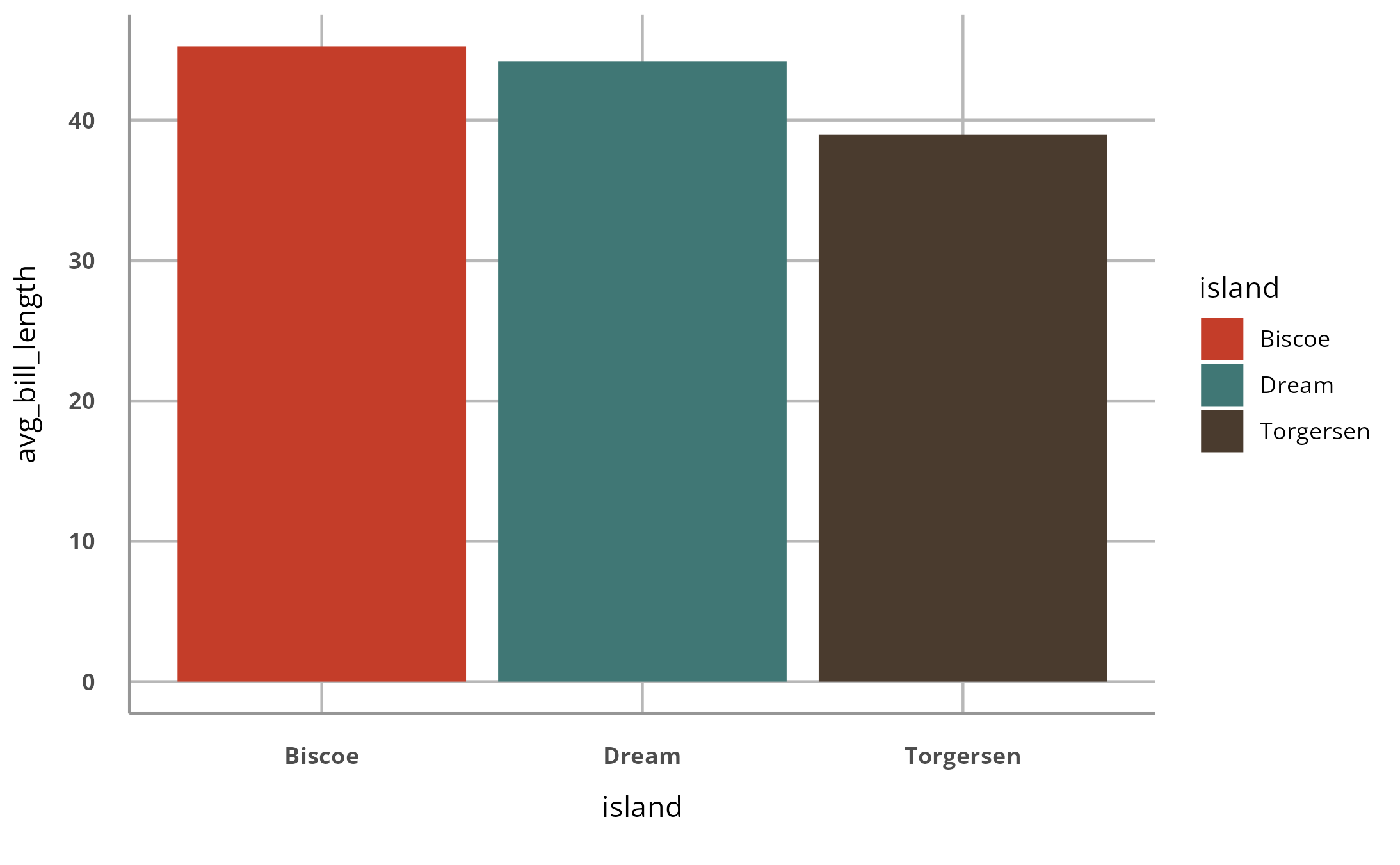
The last argument is show_legend (set to TRUE by
default). Here’s a plot with the legend removed.
penguins %>%
  group_by(island) %>%
  summarize(avg_bill_length = mean(bill_length_mm, na.rm = TRUE)) %>%
  ggplot(aes(x = island, y = avg_bill_length,
             fill = island)) +
  geom_col() +
  scale_fill_cardea_discrete() +
  theme_cardea(show_legend = FALSE)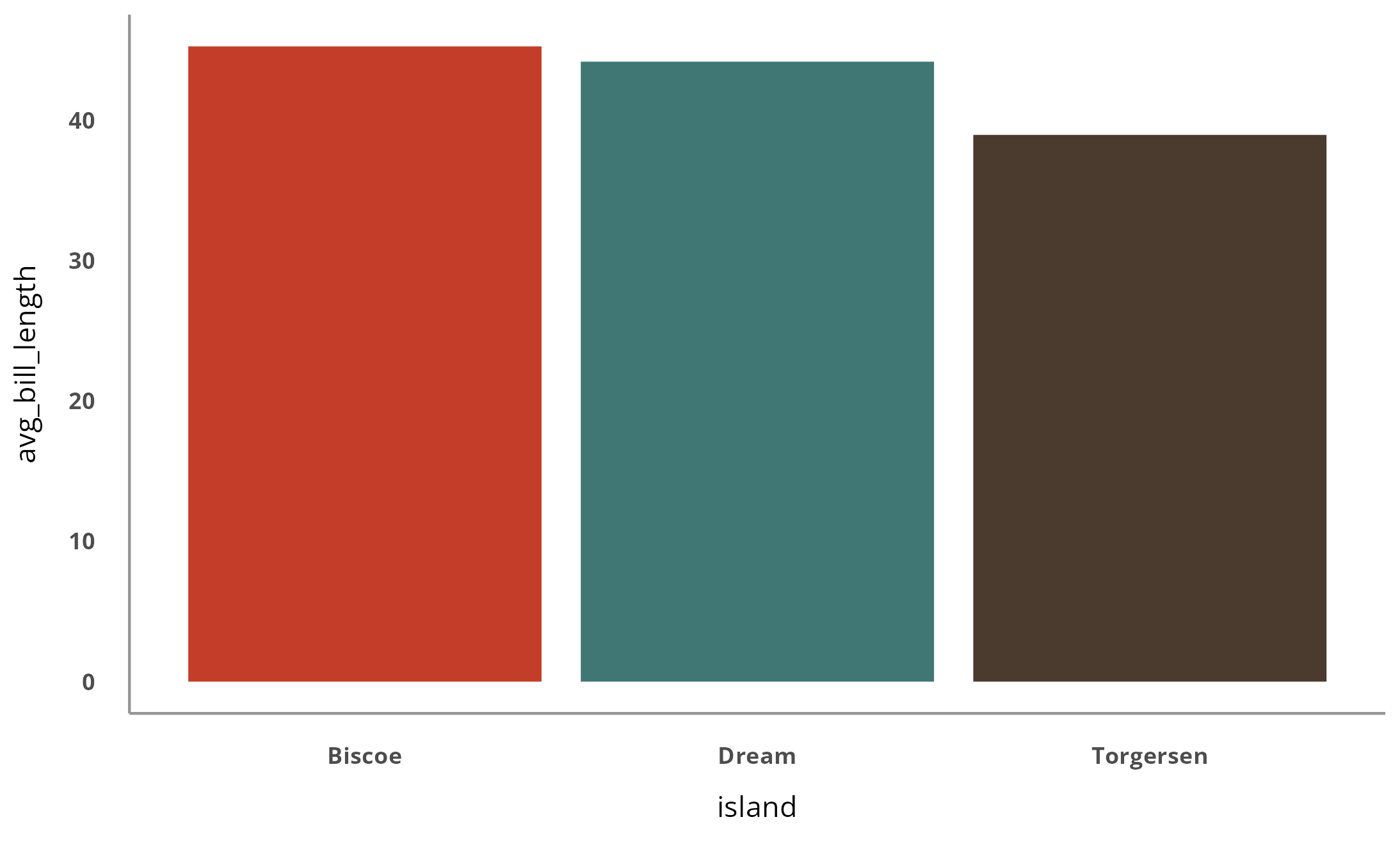
You can also add any additional tweaks you’d like using the
theme() function from ggplot2.
penguins %>%
  group_by(island) %>%
  summarize(avg_bill_length = mean(bill_length_mm, na.rm = TRUE)) %>%
  ggplot(aes(x = island, y = avg_bill_length,
             fill = island)) +
  geom_col() +
  scale_fill_cardea_discrete() +
  theme_cardea(show_legend = FALSE) +
  theme(axis.text.x = element_text(size = 20))